
Should You "Dark Mode" Your Brand To be AI-Forward?
Black is the new black

In fashion, black is timeless. In tech, black is having a moment.
The new norm of AI-native companies is dark mode by default. Black backgrounds, light text, glowing neons, and moody gradients have become the design language of choice, especially for technically sophisticated or developer-first brands.
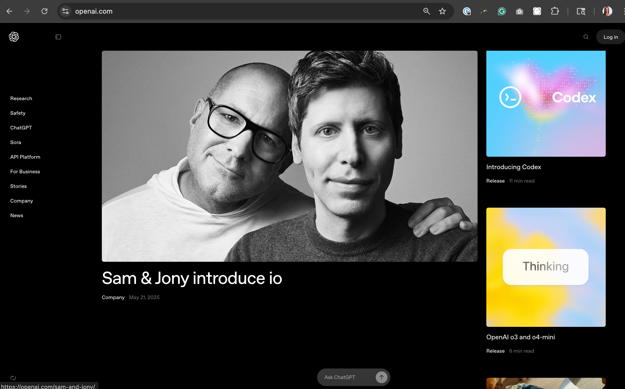
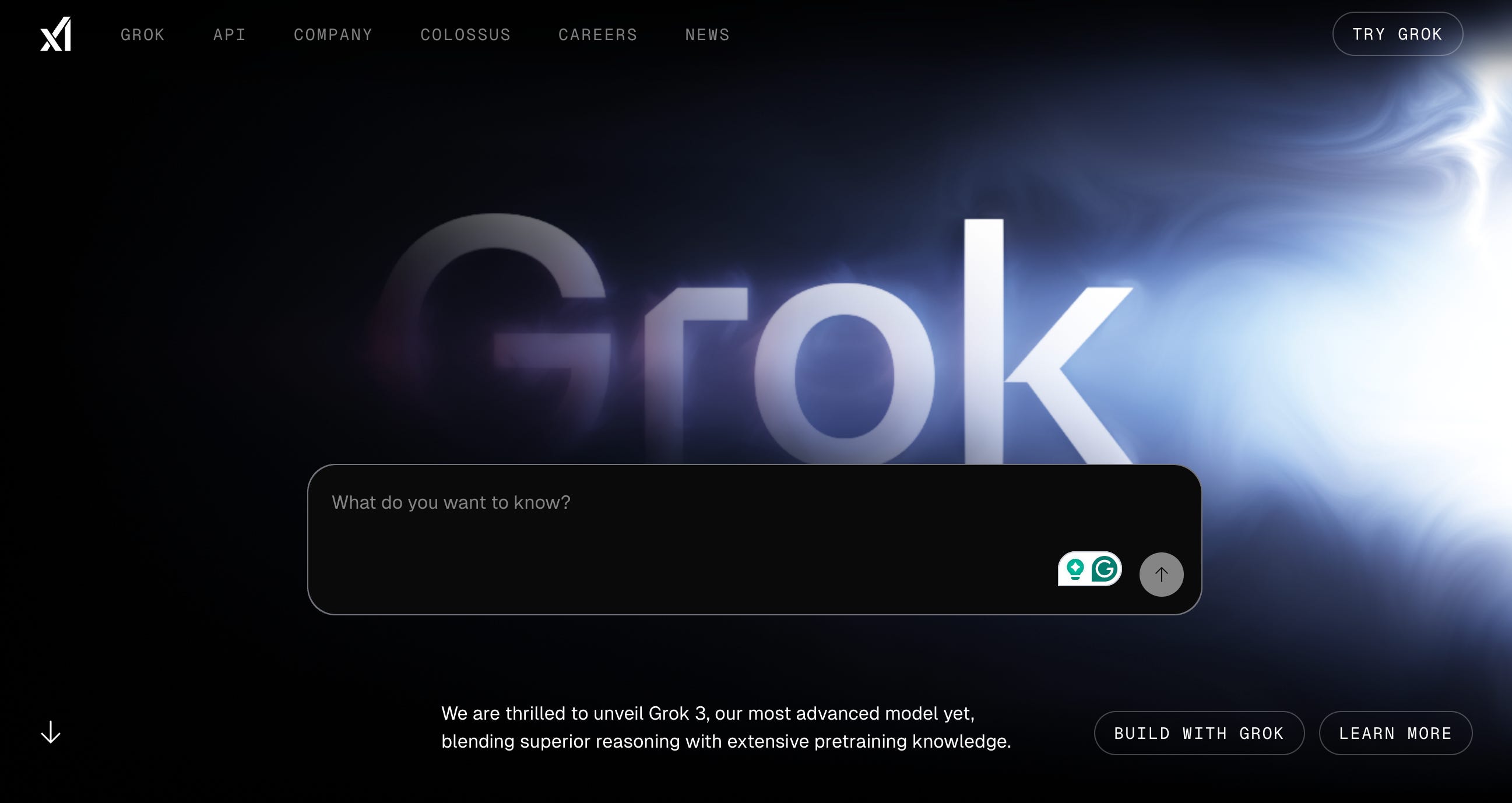
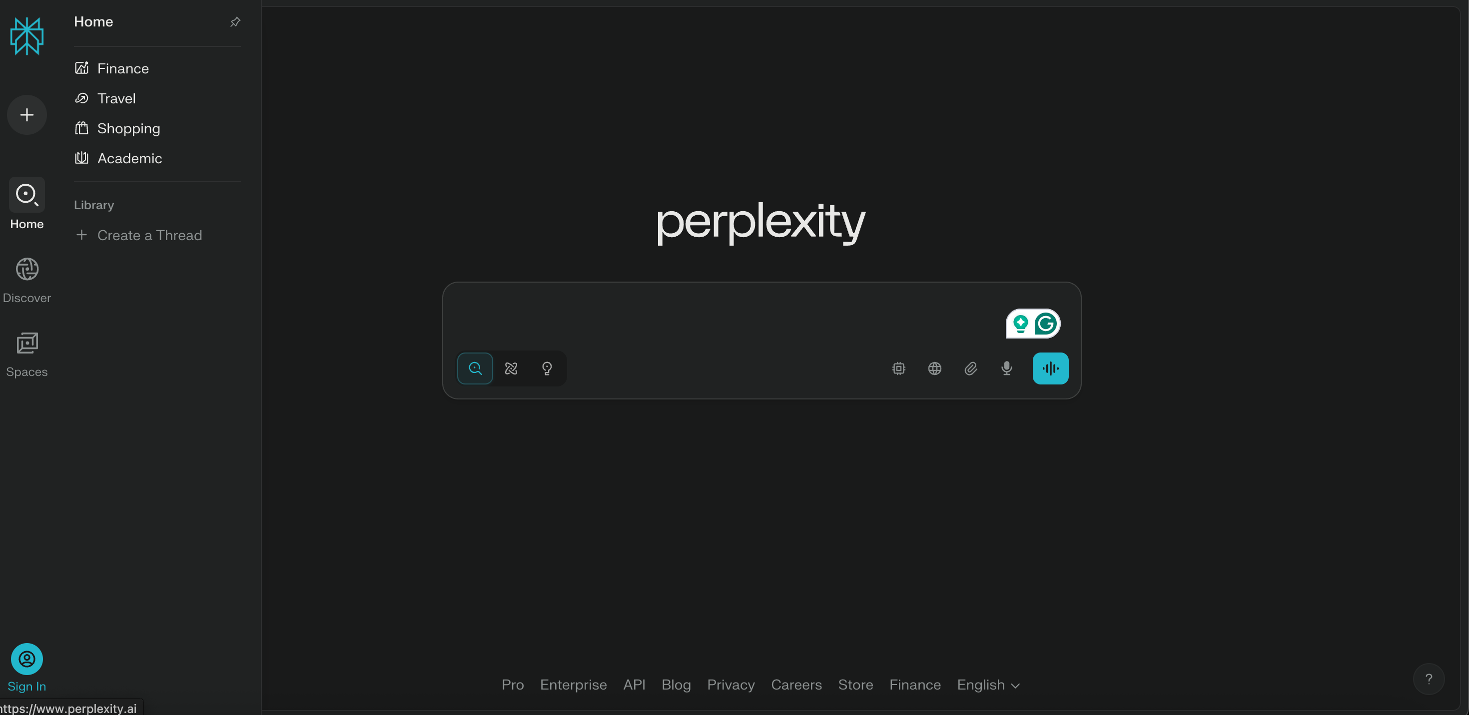
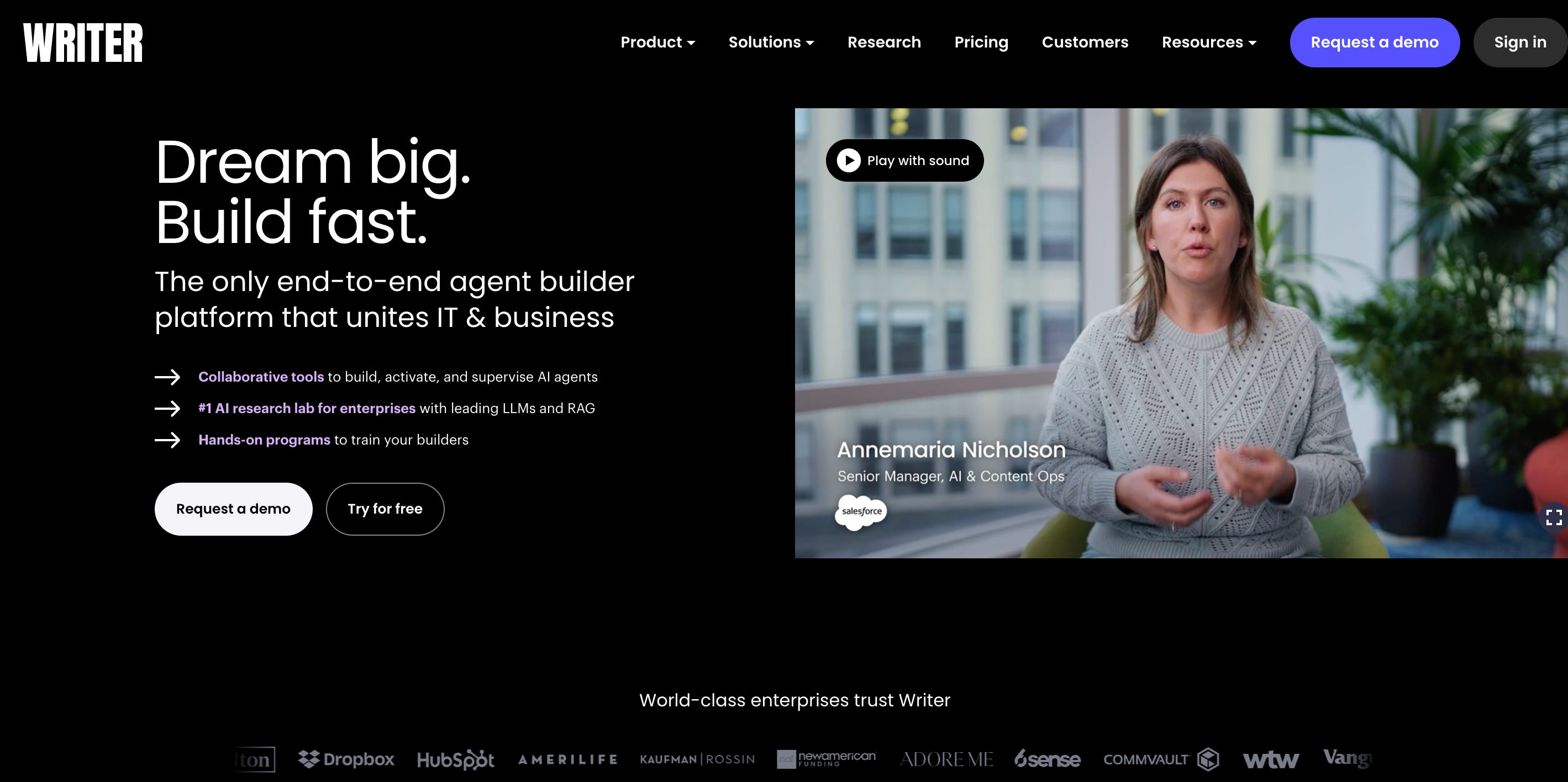
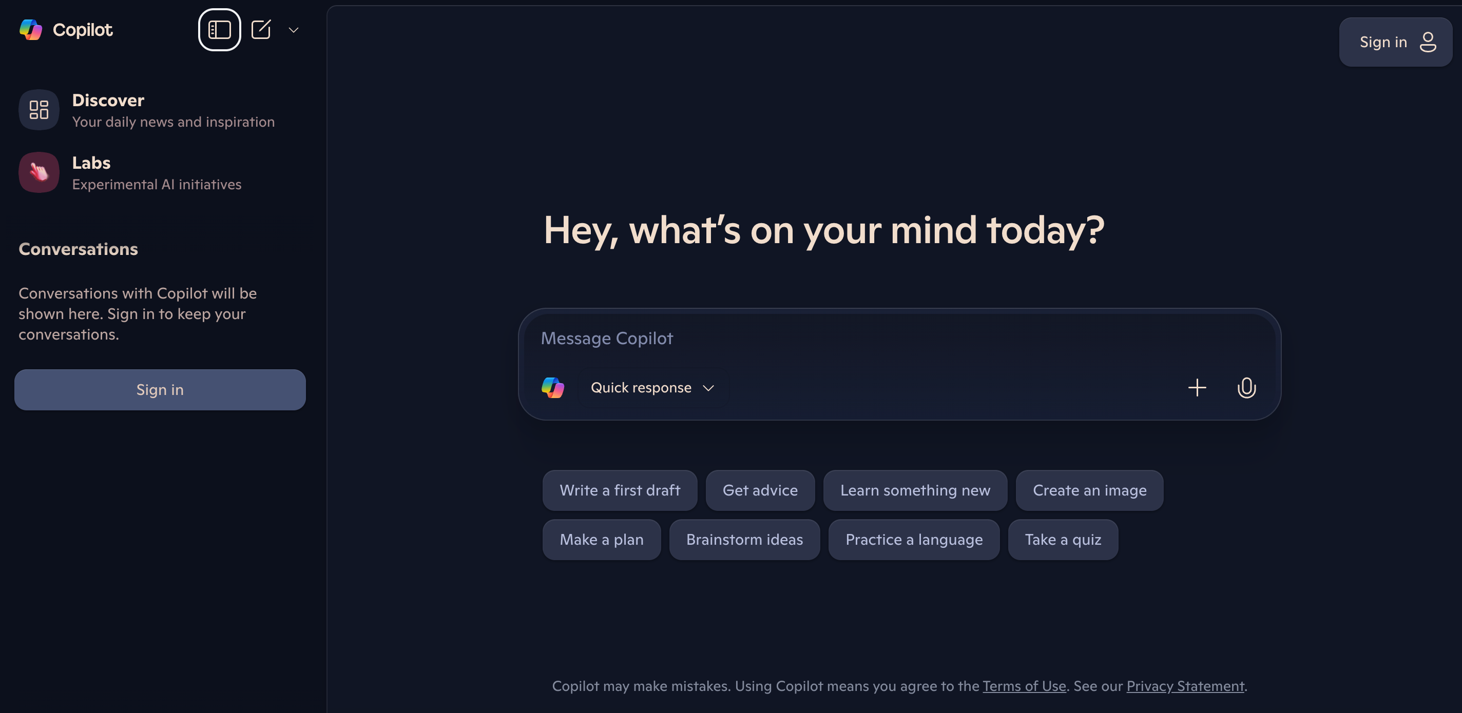
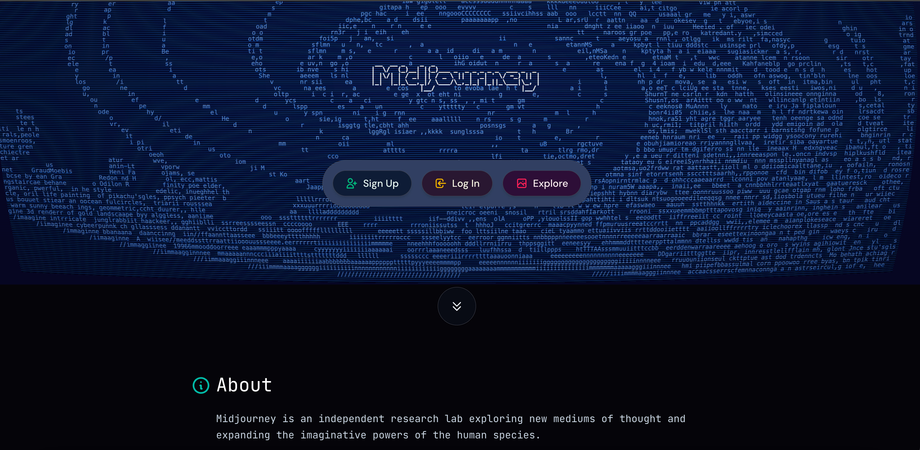
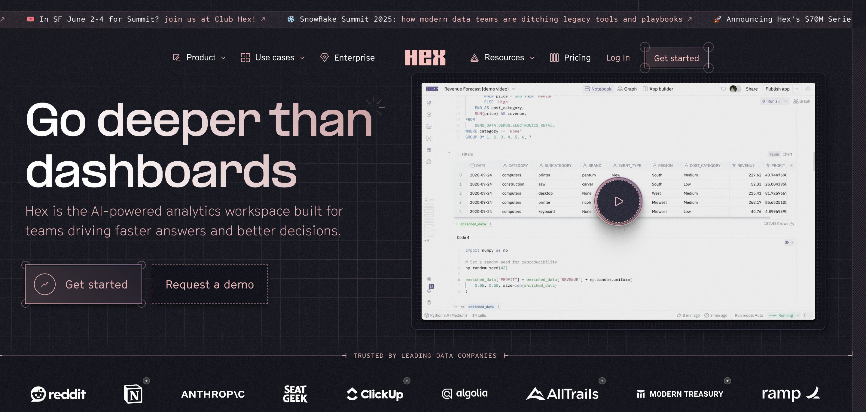
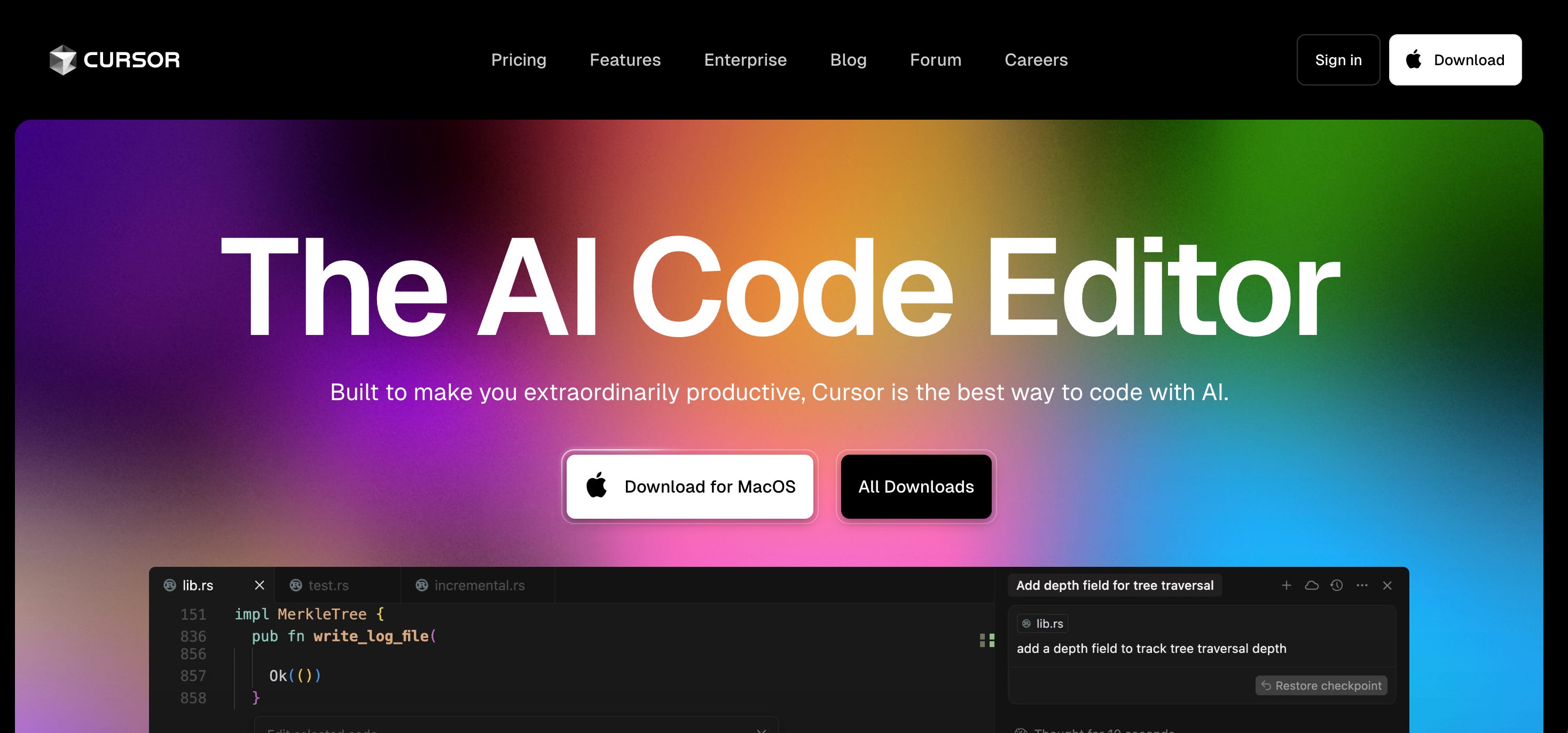
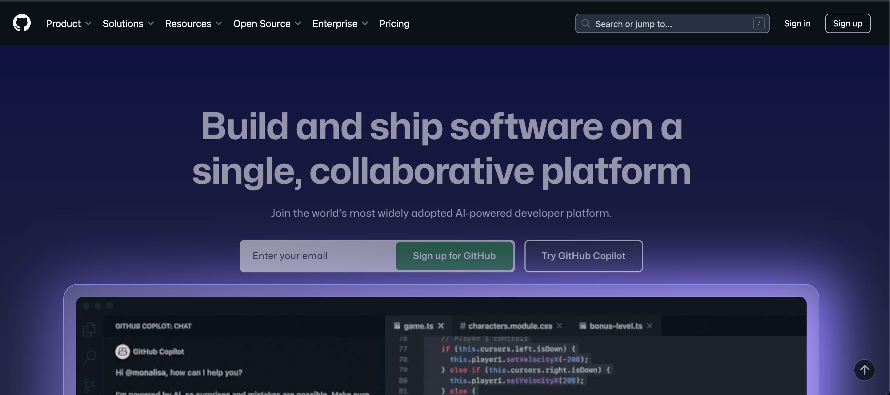
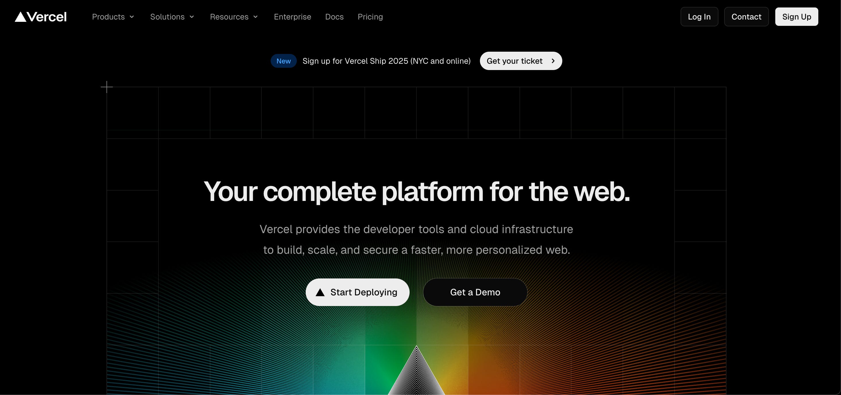
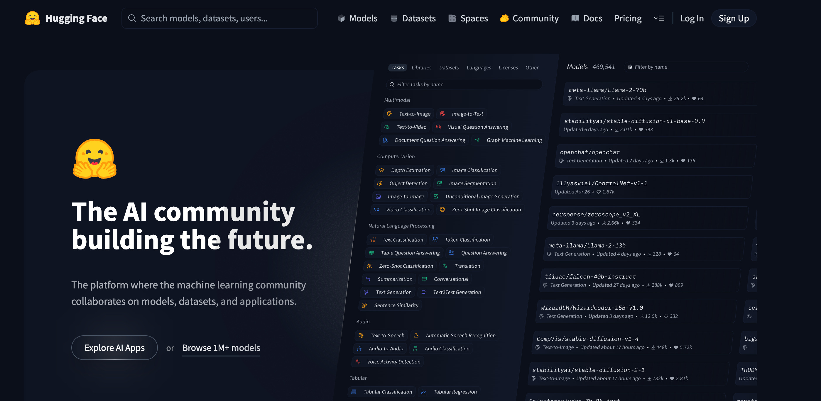
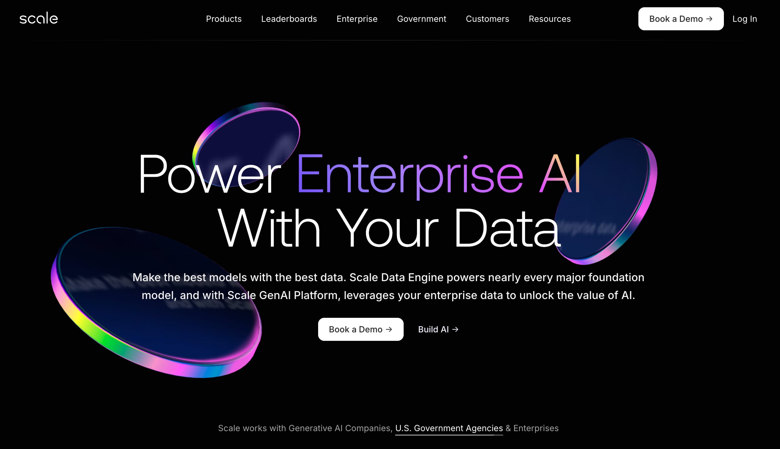
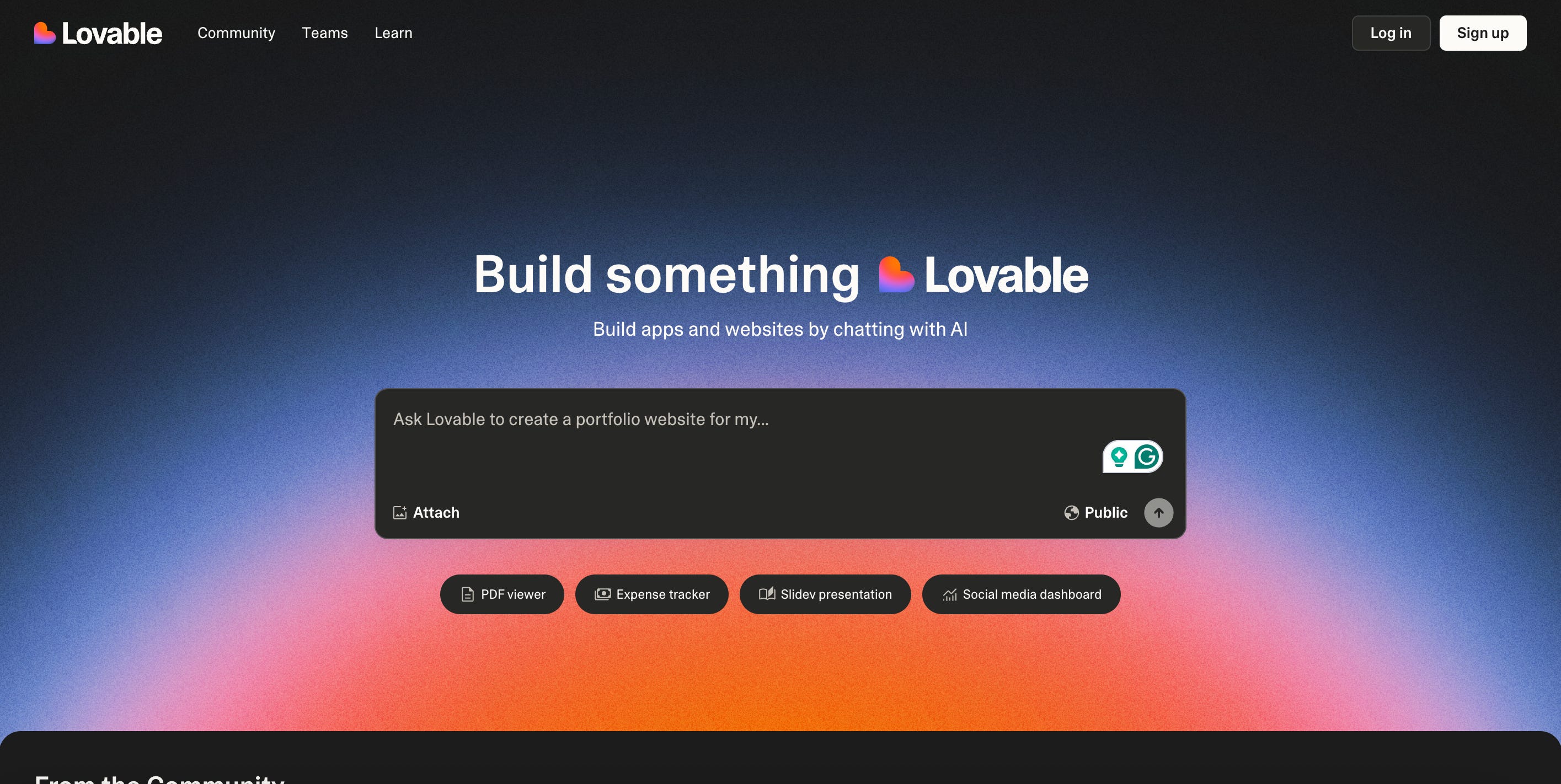
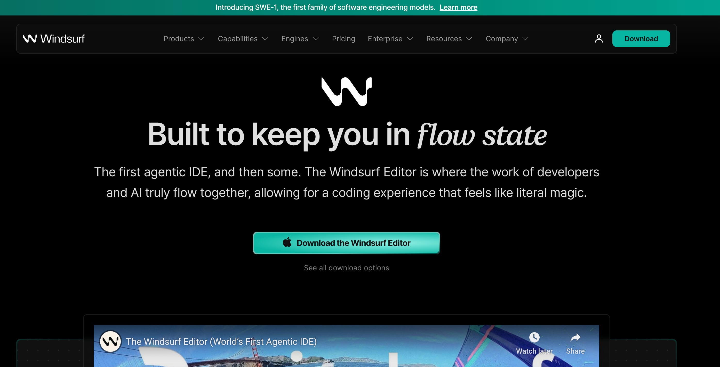
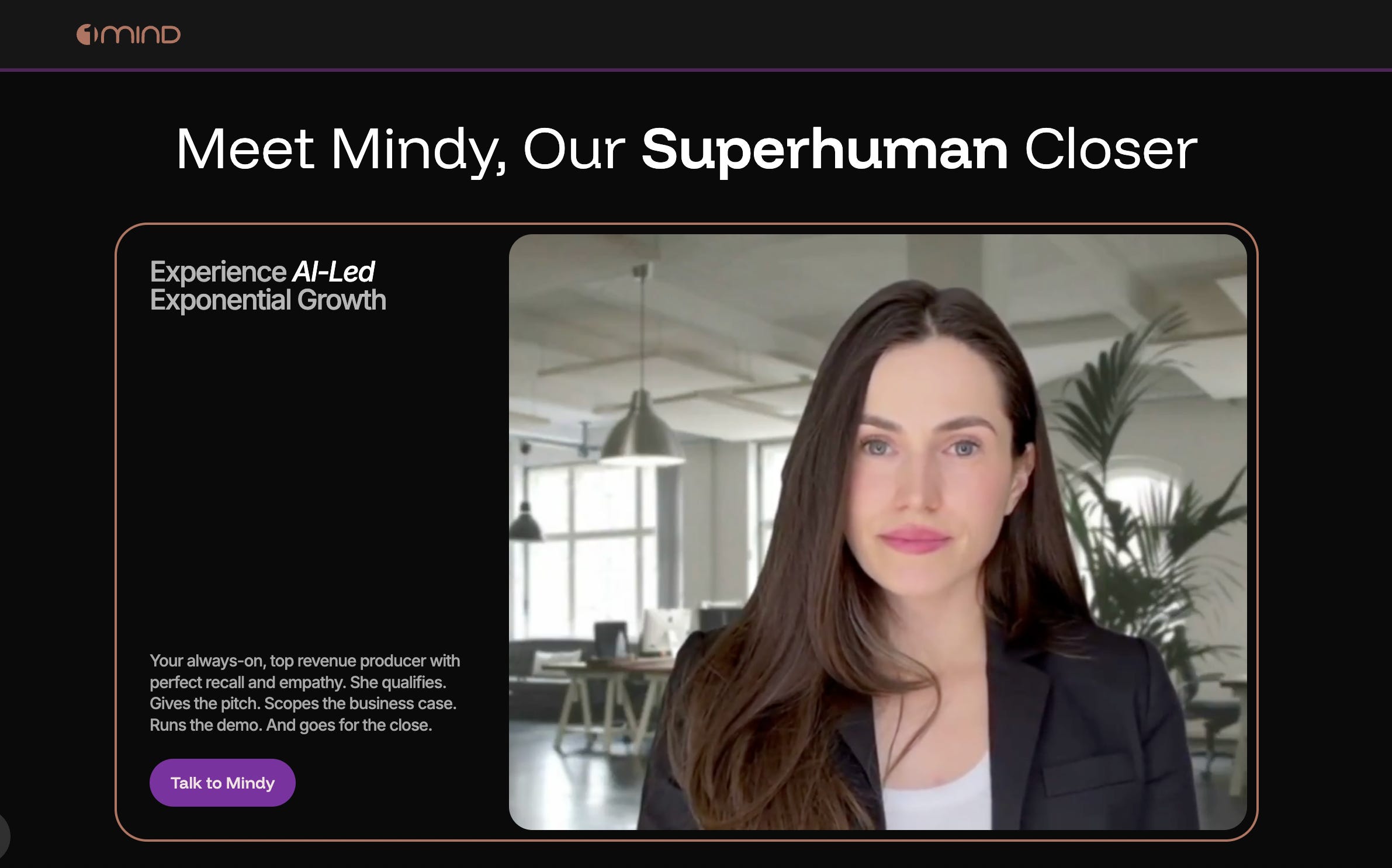
The AI interfaces of the leaders (ChatGPT, Anthropic, Gemini, Perplexity) generally default to dark mode, and the brands and websites of AI-first companies have followed. I’ve collected screenshots below of homepages from AI tastemakers big and small, including OpenAI, Grok, Perplexity, Writer, Microsoft Co-Pilot, Midjourney, Hex, Cursor, Github, Vercel, HuggingFace, Scale.ai, Lovable, Windsurf, and 1Mind. The aesthetic whispers (or sometimes screams): intelligent, futuristic, powerful.
What’s interesting is just how uniform the trend is, especially among companies selling to more technical audiences. It looks like a tribal signal that says: we are not an old-world friendly SaaS tool, we’re core infrastructure for the next era of intelligence.
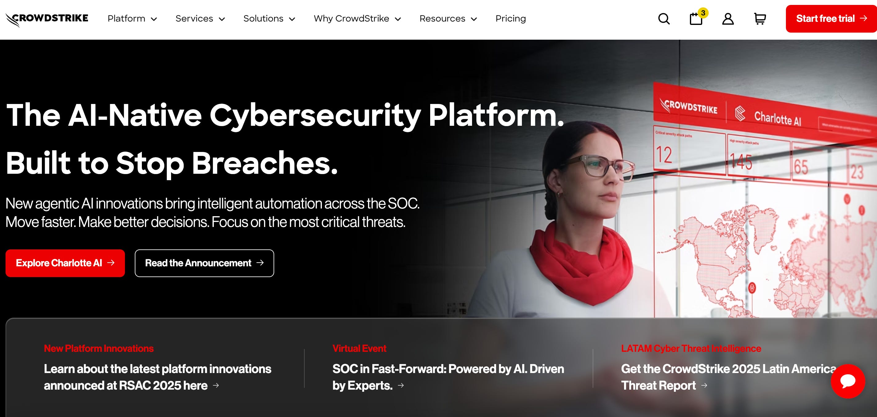
Even non-dark-mode brands are using black more liberally these days. I’ve included examples below from Nvidia, Snowflake, and Crowdstrike.
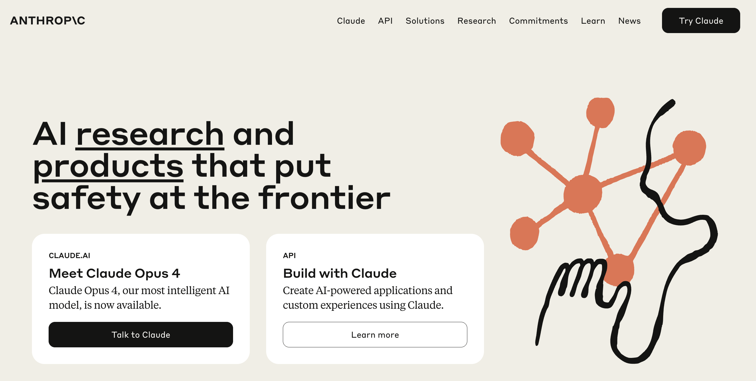
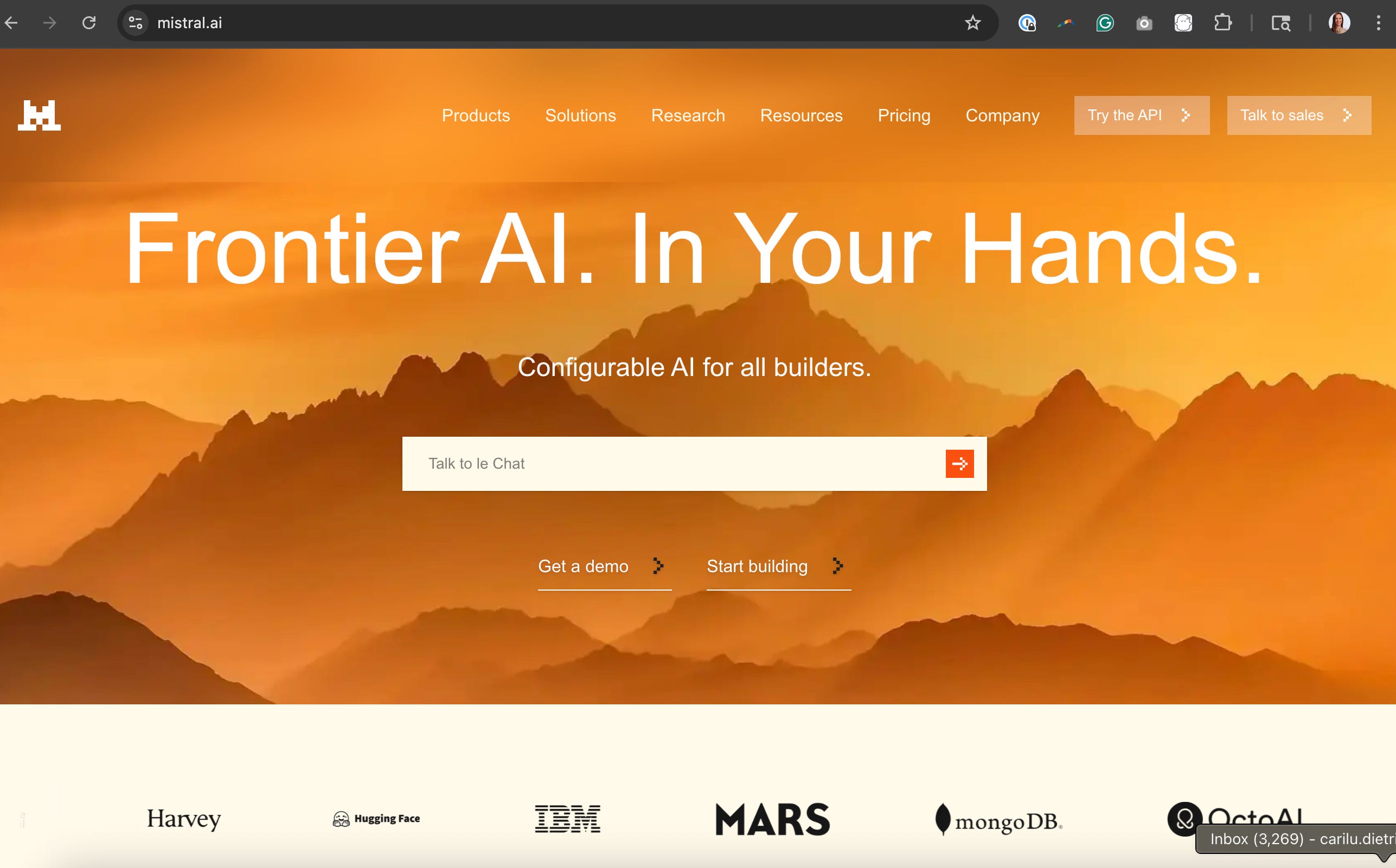
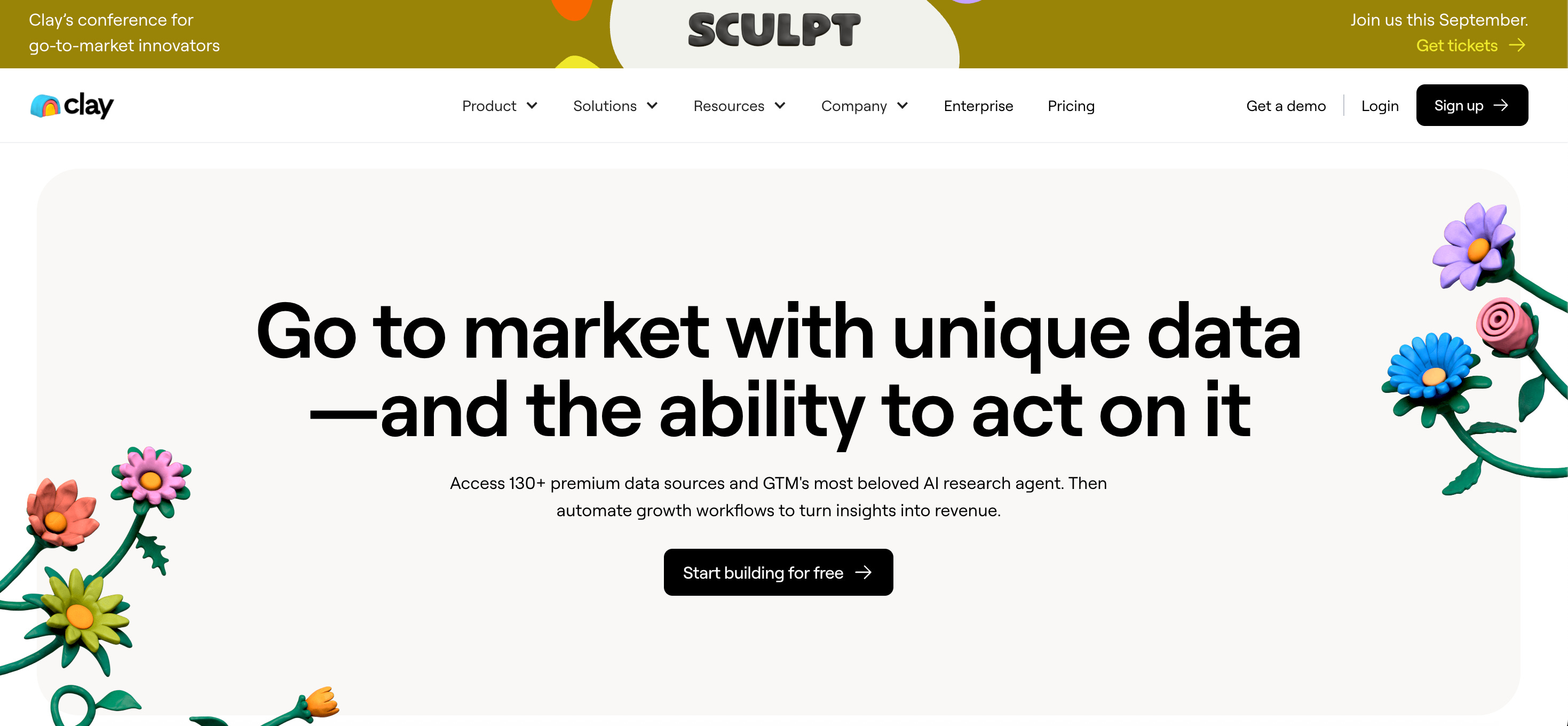
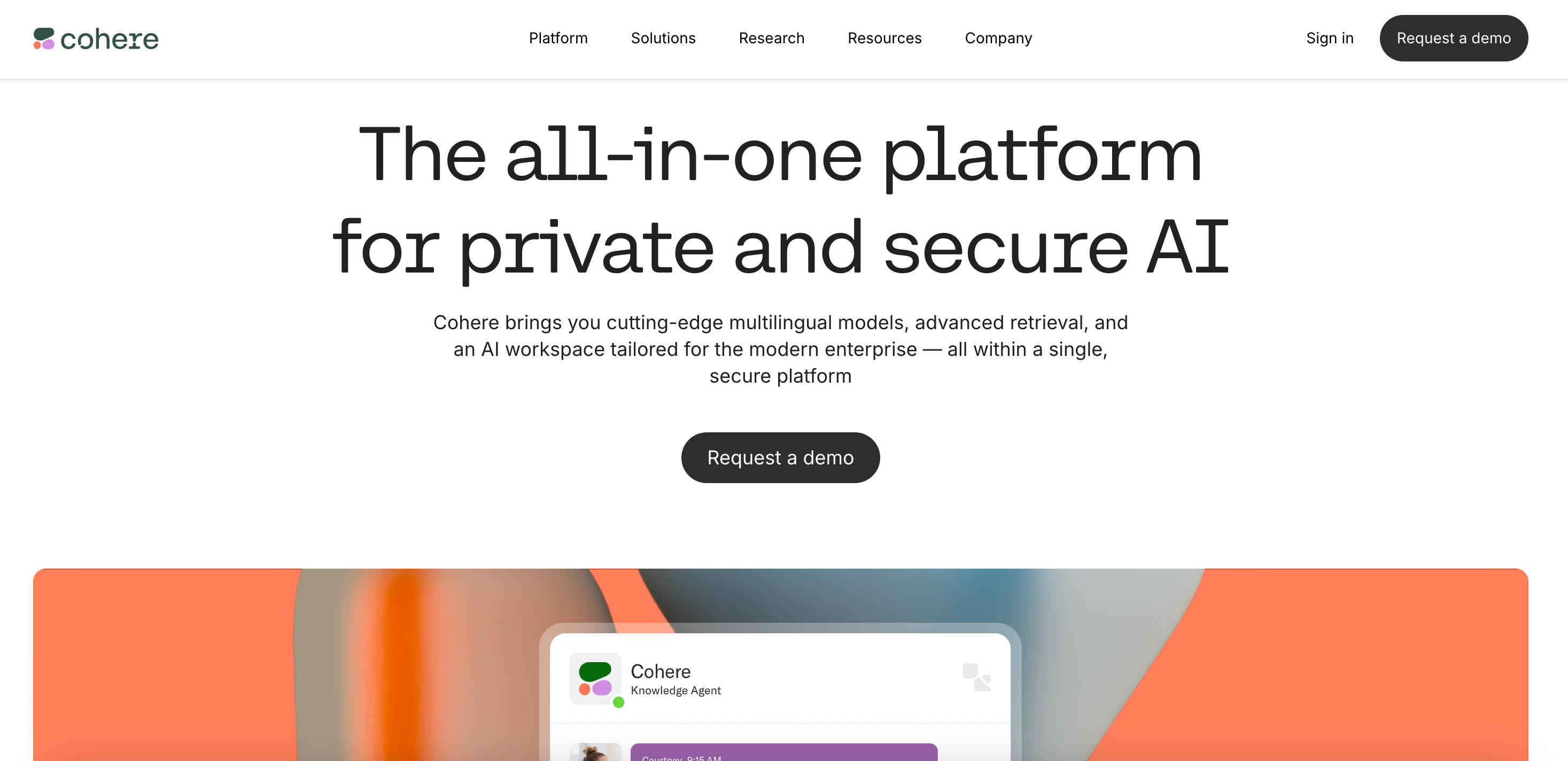
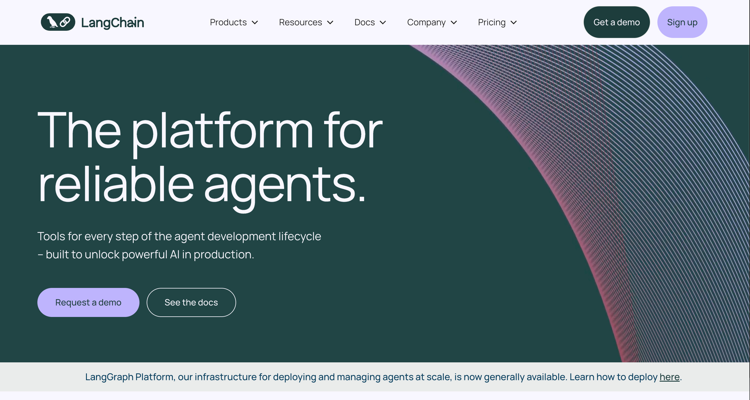
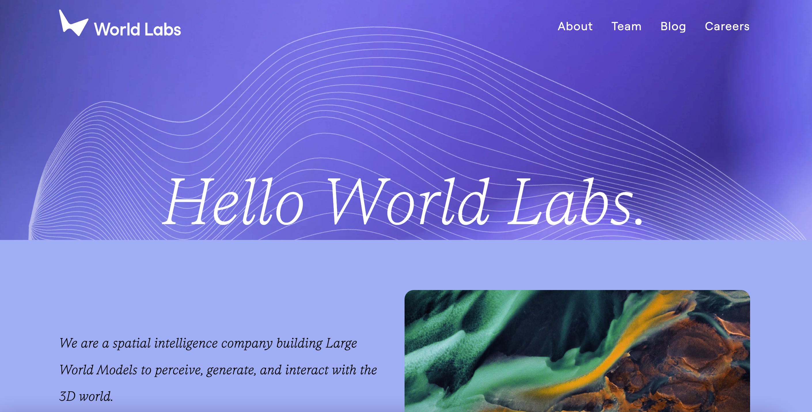
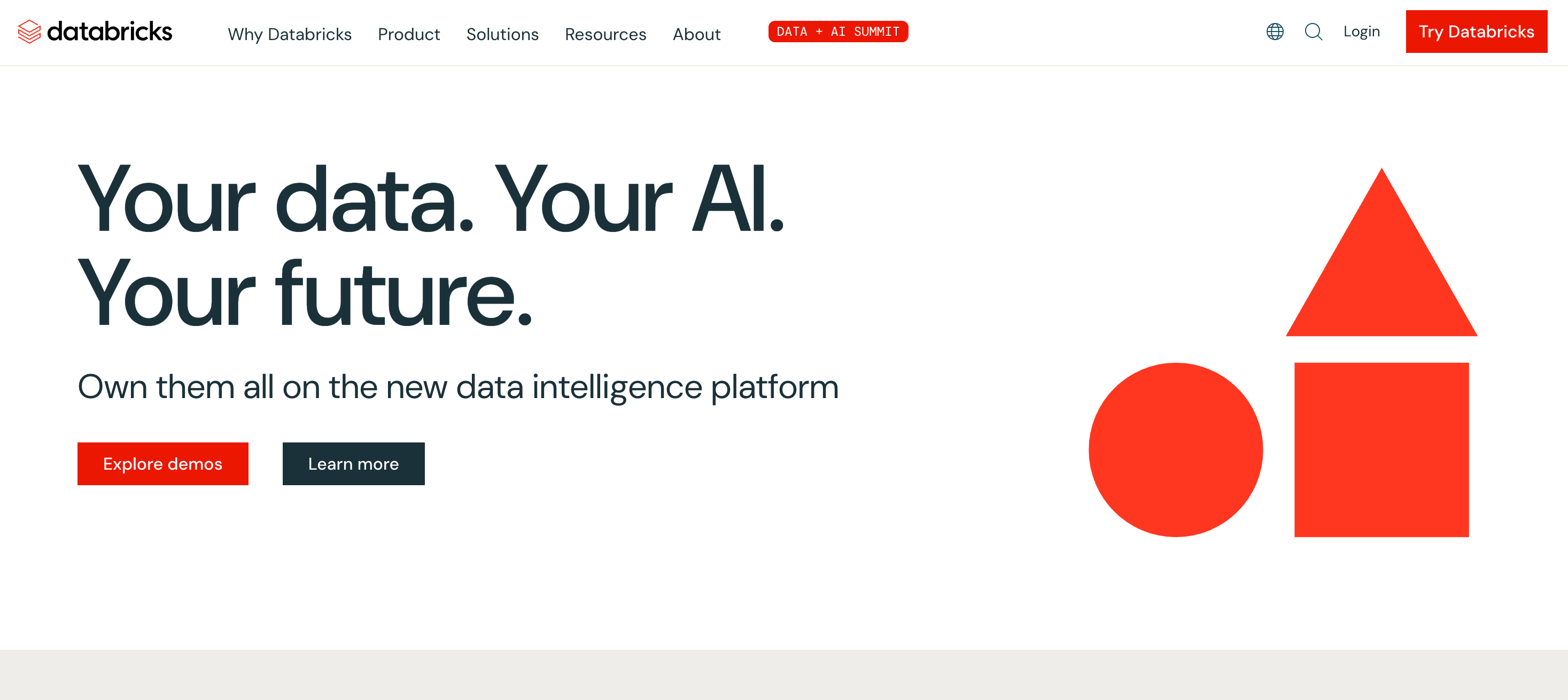
Of course, there are exceptions to the rule - a number of AI-first companies that haven’t gone dark. And some pre-AI era companies that are now AI leaders are sticking with their pre-AI brand palettes. They’ve stayed light, minimalist, or colorful, and ironically now stand out for not following the trend. Anthropic, in particular, wants to look friendly and safe in contrast to OpenAI. I’ve provided additional examples below from Mistral, Clay, Cohere, Meta’s Llama page, LangChain, Snorkel, Synthesia, World Labs, Databricks, and Atlassian.
So here’s the question for every AI-evolving company: If you’re repositioning around AI, should you be reconsidering your brand palette, too?
Not every company needs to go full sci-fi noir. But if your product is intelligent, your story is future-forward, and your buyers are even the least bit technical, it might be time to ask:
Does your brand look like it understands what’s coming?
Non-Dark-Mode Brands Using Black More Liberally
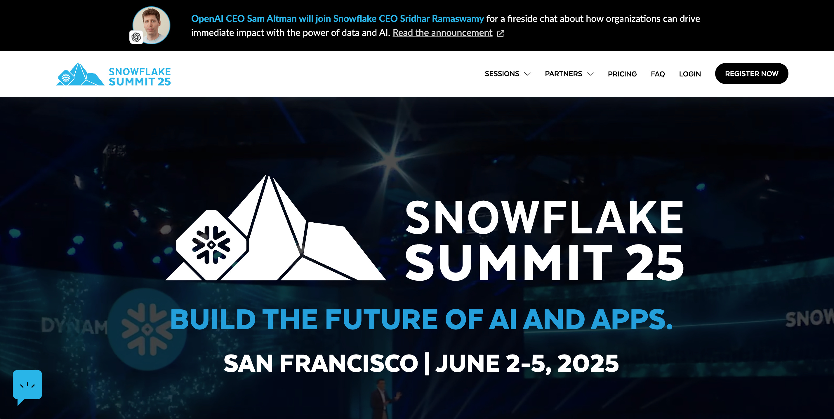
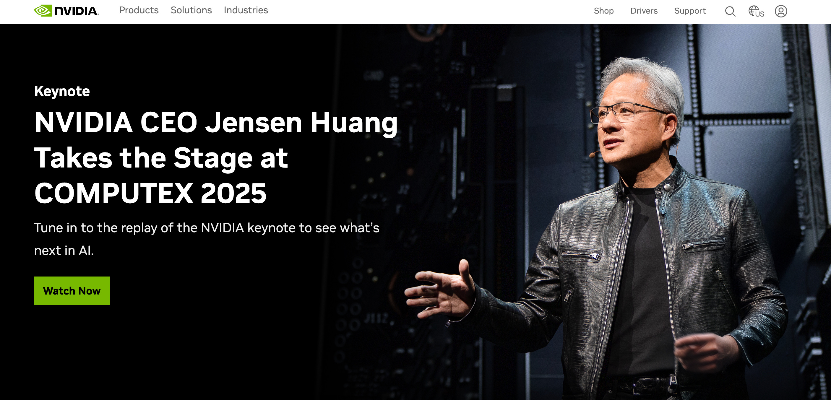
Bucking the trend


Carilu Dietrich is a former CMO, most notably the head of marketing who took Atlassian public. She currently advises CEOs and CMOs of high-growth tech companies. Carilu helps leaders operationalize the chaos of scale, see around corners, and improve marketing and company performance.
This was a great overview. I had not thought about the dominance of black until you pointed it out. Personally, I think we're at a point where black and white alone is not enough to create any brand recall.
Dark mode has moved to the physical world. A former colleague just posted a photo today of side-by-side billboards in SF. Black background, white type, small white logo. Both for AI companies. Dark mode might already be “invisible mode” in your marketing.